Why colour matters in healthcare
Why colour matters in healthcare
Somehow too often we forget about colour and its power, particularly for healing. Hospitals and medical centres are places we visit when we’re sick, injured and anxious. Ordinarily the aesthetic is overly practical, more concerned with being hygienic and inoffensive and forgetting the need to create a healing environment.
“Variety of form and brilliance of colour in the objects presented to patients are an actual means of recovery” - Florence Nightingale
We all know our perception of a place is altered if the colour is adjusted. The hue can make a space feel bigger, cleaner, warmer and more pleasant depending on the colour it is.
Increasingly hospital management and the medical profession is waking up to colour and how it can be used to calm, heal and generally assure patients, staff and visitors have a more pleasant experience when in a healthcare environment.
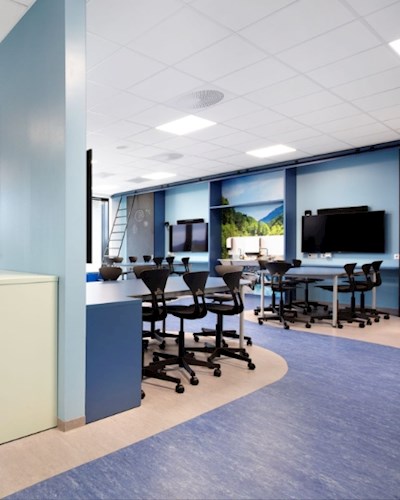
When designing for healthcare, designers need to consider the different areas of clinics and hospitals. This includes the more medically focused area used for diagnosis and treatment, recovery spaces such as wards and post-operative areas and then waiting rooms, canteens and corridors.
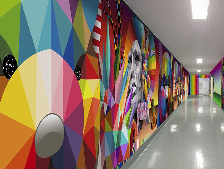
Corridors, restaurants and waiting areas are the best places for bold designs and busy patterns as these are places where people won’t be for too long. Giving places a distinct visual identity helps people find their way more easily, so strong colours and pictures can be really valuable in getting people around the hospital. However, too much saturated colour, high contrast patterns and graphics can be overly stimulating and so need to be used with consideration.
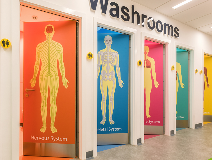
At Chorley & South Ribble Hospital, UK, Formica Group’s Younique® service provided the opportunity to design the washroom doors with different images to illustrate the various body life systems and in doing so created a bright, educational and personalised environment.
Incorporating biophillic design, the use of natural materials and natural light into these spaces, has been shown to have physical and psychological benefits which help to reduce stress and anxiety as well as improve air quality. In areas for treatment and diagnosis, calming colours and colour combinations need to be used. Here, muted pastels and neutral tones work well. Clinicians often use patient skin tone when assessing, so bold colours need to be avoided as they can lead to misdiagnosis as that shade can be reflected onto skin.
Design impact can be created by having highlighted feature areas such as around sinks or windows, using materials to create patterns as well as high quality artworks. Patients who have a window where they can see trees recover faster than those who don’t which links back to the idea of the benefits of engaging with nature in a healthcare environment.
Hospital Clínico San Carlos de Madrid
There are a few colour choices to avoid when designing for healthcare environments:
- Orange is a mentally stimulating colour and hence is avoided in large amounts in mental health settings as it can heighten emotional states
- Red is known to raise blood pressure as well as being associated with blood so is not a colour used in cardiac or surgery settings
- In Neo-natal and maternity wards yellow is one to steer clear of as not only does it makes babies cry more it makes identifying jaundice harder
We’ve decades of experience in being involved in healthcare schemes, look here for inspiration.
Category
Related Articles