Embrace the mood-boosting power of colour
Nina Bailey, European Design Lead, Formica Group, is the creative mind behind the European Formica® Collection. Here she discusses the power of colour and making choices that reflect the purpose of a project.
Colour psychology describes the effect different colours have on our mood and emotional wellbeing. It explores the connection between colour and emotion, and how the use of specific colours can have an uplifting, calming or even sobering effect.
The use of colour in interior design is one of the vital tools in a designer’s belt, and can often be their calling card. Are you a maximalist embracer of clashing colours and patterns, or a minimalist – rejoicing in the use of neutral palettes?
A new era of colour
Undoubtedly, architects and designers are also guided by trends in colour, and in 2022 we’re seeing homes and businesses embracing colour more creatively across Europe. We’re emerging from nearly three years of a global pandemic, and as a result of that how people use their homes has changed. Workplace environments have also undergone a seismic shift, and the hospitality industry has been at the sharp end of our lockdown life.
Although we’re all unique, certain colours have broad-spectrum effects on our moods, based on how they’re traditionally perceived. In my role as European Design Lead for Formica Group, it’s interesting to see how these colours are now being applied to homes, retail spaces, offices, restaurants and more, with the aim of improving user experience.
Top mood-boosting colours
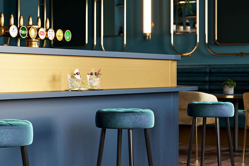
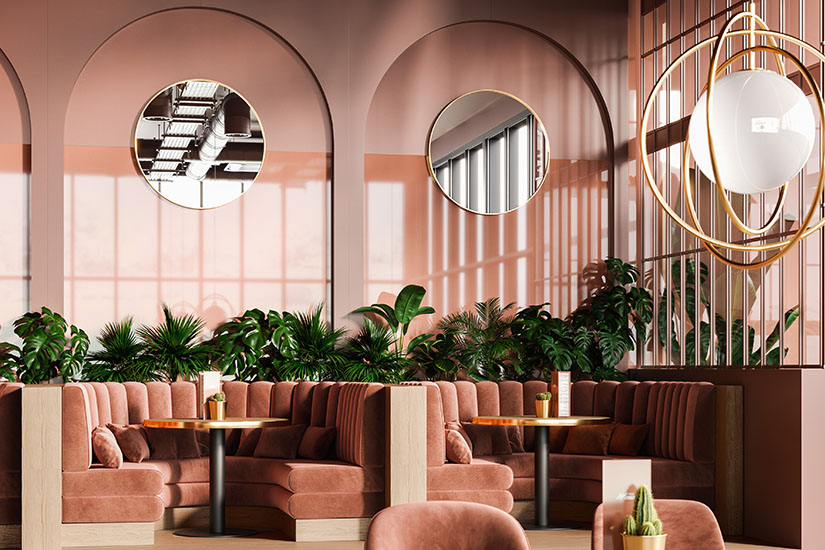
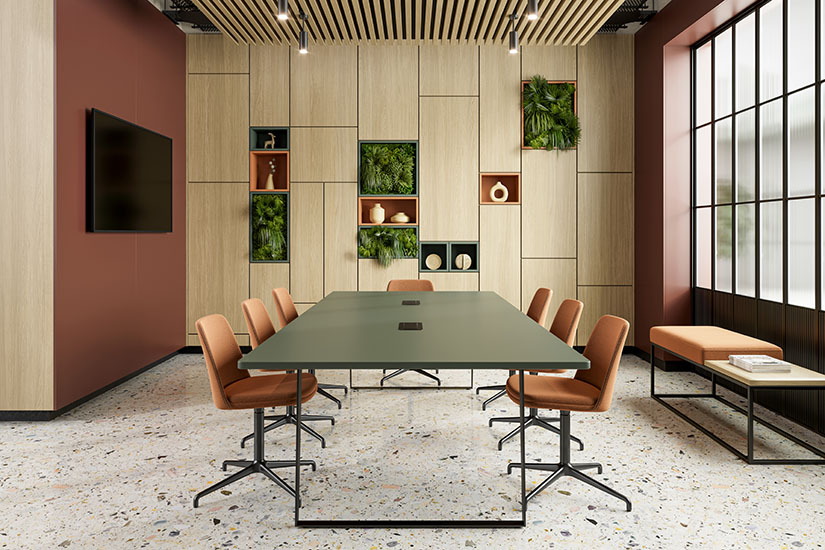
Red: an active colour, promoting energy and vitality. Hues of reds, such as terracotta, are lively but warming, and are seeing resurgence in 2022. Perfect for active spaces such as retail and areas of hospitality.
Green: connected with nature and promotes overwhelming calm whether it’s deep forest or fresh mint. It is a popular choice in bedrooms and healthcare settings for this reason – supporting a relaxed and calm biophilic environment.
Blue: another passive colour closely connected with nature and the sea (also known for its calming properties). Blue is said to boost focus and serenity and is a popular choice for kitchens and living areas as well as educational and office settings.
Yellow: associated with happiness, sunshine and light, yellow in all its hues is a bright, awakening colour ideal for the kitchen, washrooms and dining areas.
White: Used liberally, white has the effect of promoting tranquillity and peace. It’s used in a lot of Japanese and Nordic design and represents cleanliness and calm. It also works as a blank canvas for displaying artwork and colourful furnishings. Brite White has been a popular choice with Formica Group customers around the world in recent years and is finally available in Europe, it forms part of our new Formica® Collection for 2022.
Bringing the outside, in
We are intuitively drawn to colours that are inspired by nature – earthy tones, blues and greens and shades of browns and red, for example. More recently, interiors have been influenced by biophilic trends – that is, bringing nature inside.
A boom in Instagram-friendly indoor plant arrangements, natural materials and colours have all contributed to a demand for more choice when it comes to colours and finishes that evoke the outdoors. It inspired the Formica Group design team when devising our newest range of ‘Colors’ and ‘Woods’ ranges.
However, natural materials such as wood can be costly and can require considerable maintenance to maintain its looks. Laminate surfaces are an excellent alternative for those looking for versatility, longevity and durability – while still achieving the desired high quality finish.
Injecting colour into your projects
Harnessing the mood-boosting power of colour psychology is a must for designers in 2022 – leveraging the vast array of paint colours available, and pairing them with materials, fabrics and light fittings that complement or match the chosen colour.
Materials such as laminate, for example, are extremely versatile and come in a vast array of colours and designs (including wood, concrete, textiles, marble and metal effects, to name just a few material looks). It can be used for work surfaces, furniture, wall panelling, doors, washroom surfaces and cubicles to really create a ‘wow’ factor that fits with the designers colour scheme.
So when your next project is underway, consider the power of colour, and choose colours that reflect the purpose of that room or space.
Article previously published on InteriorDesignerMagazine
Category
Related Articles


