We discuss Pantone’s 2020 Colour of the Year
Pantone attracted attention around the world when it revealed Classic Blue as its 2020 Colour of the Year. For more than two decades, the award has played a key role in product development and purchasing decisions. This year’s choice, however, is seen as a timeless selection.
“We are living in a time that requires trust and faith,” said Leatrice Eiseman, Executive Director of the Pantone Color Institute, before hailing Classic Blue as a “solid and dependable blue hue we can always rely on.”
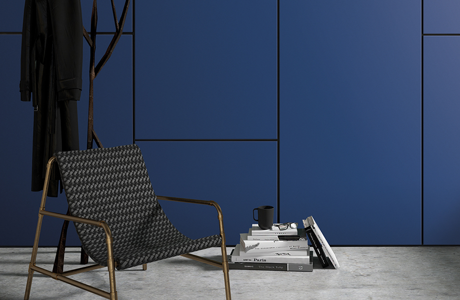
Our closest match – Formica® Laminate in Marine Blue – shares the same characteristics.

Eva Hoernisch, our Group Creative Product Director, believes Classic Blue has been chosen for its longevity in colour. “If it was in football, we would speak about a lifetime achievement award,” she says.
“A marine or navy deep blue are staples in every colour palette, be it for automotive, fashion or interiors. It’s acting as a foundation – almost like black. It’s relatable, peaceful and genderless, and is liked for its honesty and versatility.”
She adds: “There’s much discussion on how we need to slow down consumption. For example, clothes get worn just a few times and are then thrown away. And because the quality is mostly so low, they can’t even be recycled. A timeless coat in classic blue, made in good quality materials, will last a lifetime. That’s why this colour is Colour of the Year.”
Our Design Manager, Nina Bailey, agrees with Eva’s assessment. Nina says: “In the current political climate, people feel uneasy about the future of the planet. Classic Blue is an earthly colour that reminds us of the world’s natural palettes and beauty. It’s certainly not a trend colour, but rather a colour that calms us and grounds us to our planet.”


Swatch Not available
A colour palette to complement pantone’s colour of the year 2020
To celebrate the unveiling of Classic Blue, our design team has produced a complementing colour palette grounded in subtle, soothing colours such as Marine Blue, Azur, Mouse, Earth and Eldorado.
“The palette is calming and meditative to evoke a sense of peacefulness,” says Nina. “It works harmoniously with a delicate balance of warm and cool soothing tones, providing wellness to any interior space.
“I envisage it working perfectly for commercial interiors, for example office spaces, providing a relaxed environment and encouraging mindfulness for a more productive and effective workplace.”


