5 stunning tone-on-tone combinations
5 stunning tone-on-tone combinations
Maximise the appeal of limited spaces with the calming nature of tone-on-tone design, where an entire space is decorated with different shades of a single colour. Nina Bailey, our Design Manager, has produced five stunning tone-on-tone palettes.
“The concept,” says Nina, “is to choose one hue for a space and then base the scheme within graded tones of that colour, giving a simple and sophisticated overall look with as little contrast as possible.”
Across the interior design industry, tone-on-tone trends are now increasingly prominent. They are ideal for everything from restaurants and bars to office spaces and studios, so it’s easy to understand their popularity.
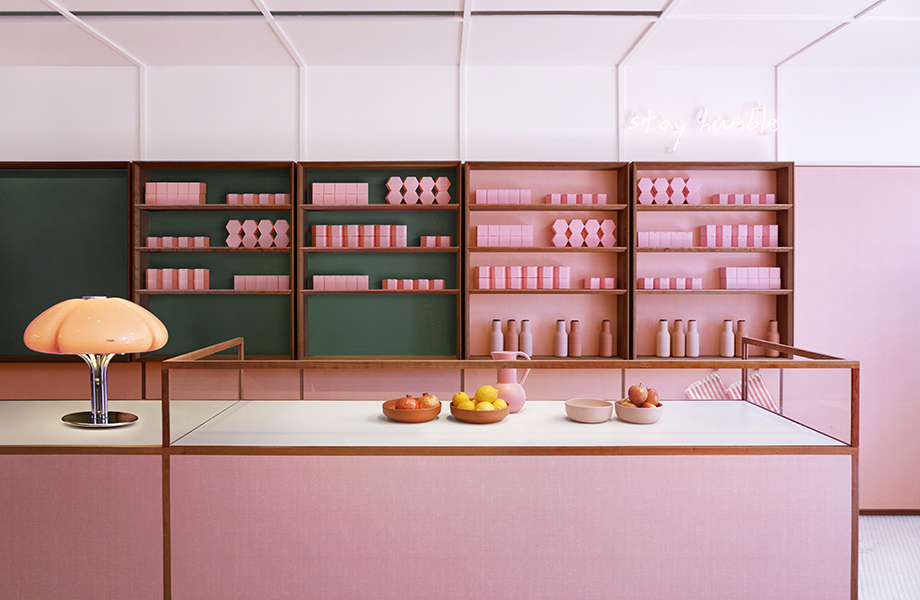
Child Studio, the visionaries behind the all-pink interior of Humble Pizza on London’s famous King’s Road, even used Younique by Formica Group to replicate our vintage décor Linen and create a sleek 1950s-style aesthetic. The resulting interior is quirky, eye-catching, and a huge standout on the high street – generating interest and customers from near and far.
Our Formica Laminate collection is at the forefront of this tone-on-tone movement. Nina explains: “The luxury effect of tone-on-tone palettes, and their ability to make smaller spaces appear larger, makes them highly attractive.
“Because you’re essentially only dealing with one colour, this approach to design can seem effortless. However, it can be difficult to find the same tonal values across various materials and brands to create a blending palette. We’ve worked on creating a selection of colour palettes that demonstrate the tone-on-tone ethos across our products, giving you the design freedom to create what’s needed for your space.”

Feel the teal
Cool the stresses of a typical workplace environment by harnessing the restorative power of tone-on-tone teals. Using teal promotes tranquillity due to its natural association with water. Teals in office settings are a great way to lower tension and increase productivity.
Teal colour palette products: Capri, Dusty Jade and Fontana.
Moody blues
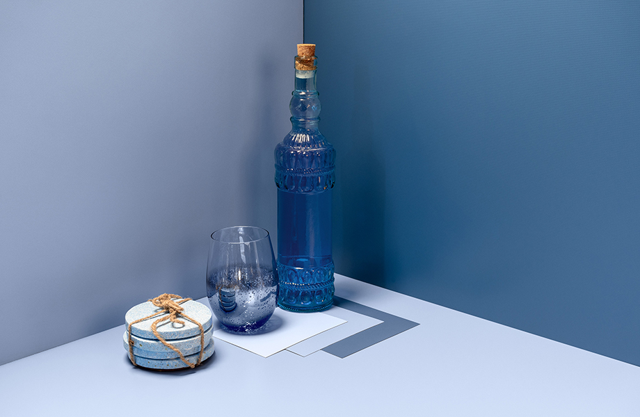
A blue colour palette really sets the scene for nightlife, it works best when creating a darker environment with separate seating spaces to accommodate multiple groups of guests, harness the potential of blue to bring your next bar project to life. “Blues are particularly evocative. Layer dark and light shades together to create energy and vibrance.” Says Nina.
Blue colour palette products: Denim, Just Blue and China Blue.
Classic Creams
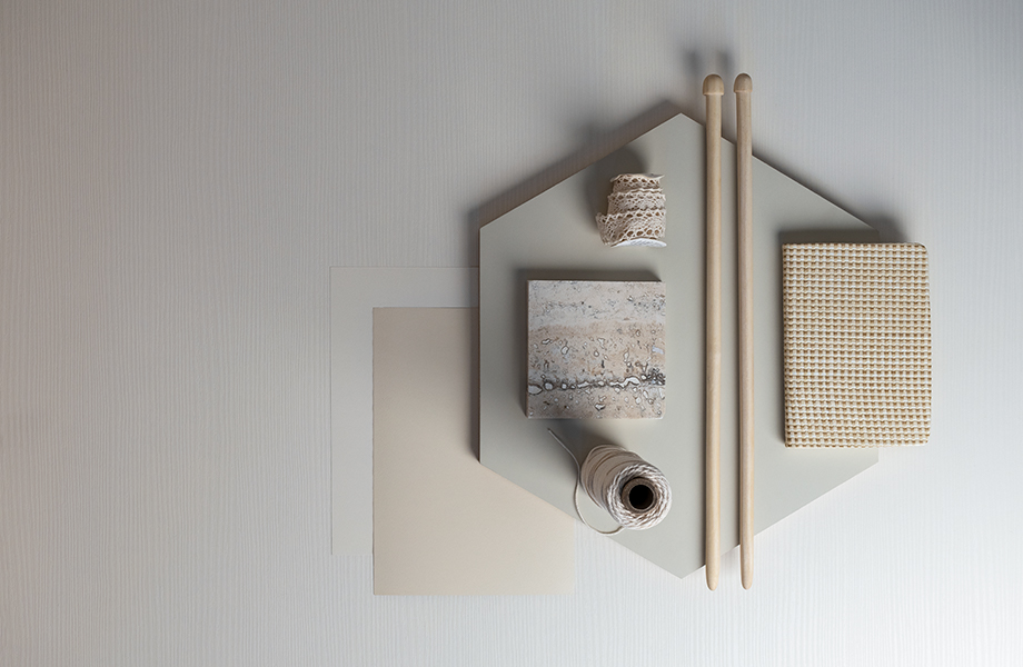
Make the most of natural light with a cream palette that is bright, reflective and entirely timeless. “A cream tone-on-tone palette is ideally suited for a studio space,” says Nina. “It creates a clean, distraction-free environment that promotes thought and creativity.”
Cream colour palette products: New Magnolia, Antique White and Seringa.
Grey matter
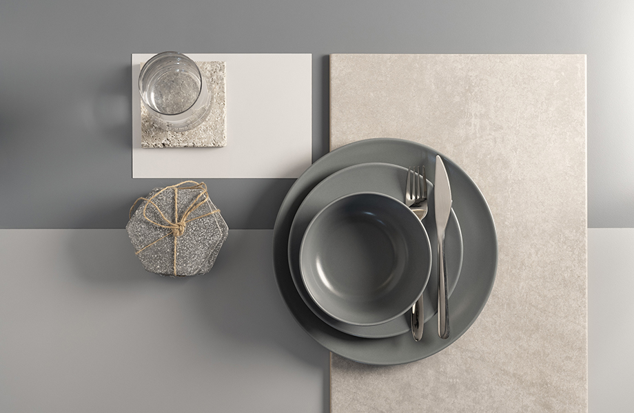
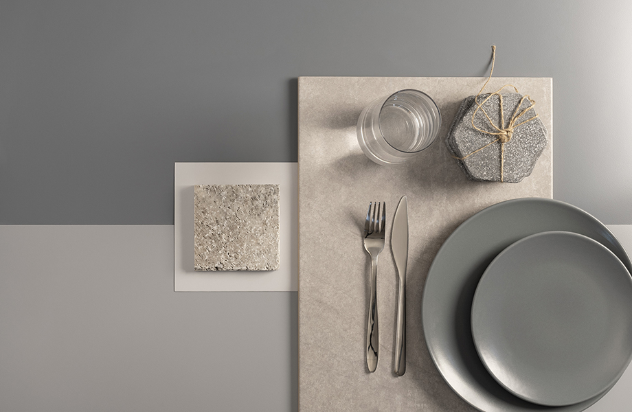
Prominent in interior design, grey is frequently used to make other colours pop. Creating an entire tone-on-tone palette using only varying shades of grey encourages a sleek sense of depth and makes for a contemporary environment. Nina says: “This palette works really well in a restaurant, with tonal greys offering a clean look while still creating a moody atmosphere.”
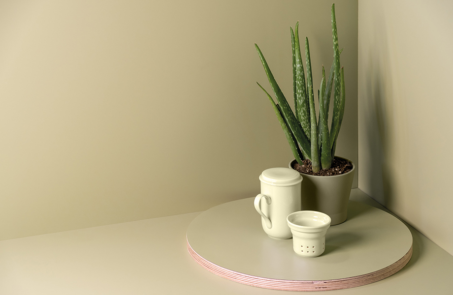
Going green
The elegance of well-chosen greens can make the perfect backdrop for welcoming cafes. Graceful, natural and classically mellow, clever green palettes can be used to great effect in social settings. Whether you’re looking for drama or a simple, soft ambiance, green can cover every possibility.
Green colour palette products: Wasabi, Artichoke and Pale Olive.
Order your free tone-on-tone colour palettes
Get inspired for your next project by exploring the full breadth of our Formica Laminate collection – including on-trend colours, woodgrains and authentic patterns. Follow the campaign story on LinkedIn and Instagram.

