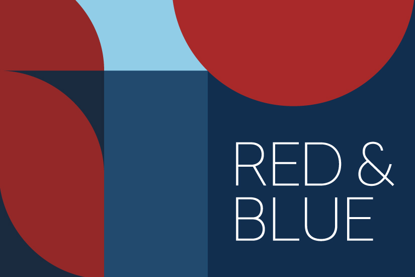
The Power of Reds and Blues in Neuro-Inclusive Design
As we continue our journey into designing neuro-inclusive environments, we now turn our attention to the impact of colour—specifically, the use of reds and blues in interior spaces.
Colour is not just a visual element but a powerful tool that can significantly influence mood, behaviour, and sensory experiences. When designing for neurodiversity, this becomes even more crucial as different hues can either support or challenge the sensory needs of neurodiverse individuals.
The Dynamic Nature of Red
Red is a colour that commands attention. It stimulates both the body and mind, generating energy and excitement. However, it's important to approach red with care in neuro-inclusive spaces. In large quantities, especially in its brightest shades, red can become overwhelming, potentially leading to feelings of defiance or aggression. This makes it less suitable for areas intended for relaxation.
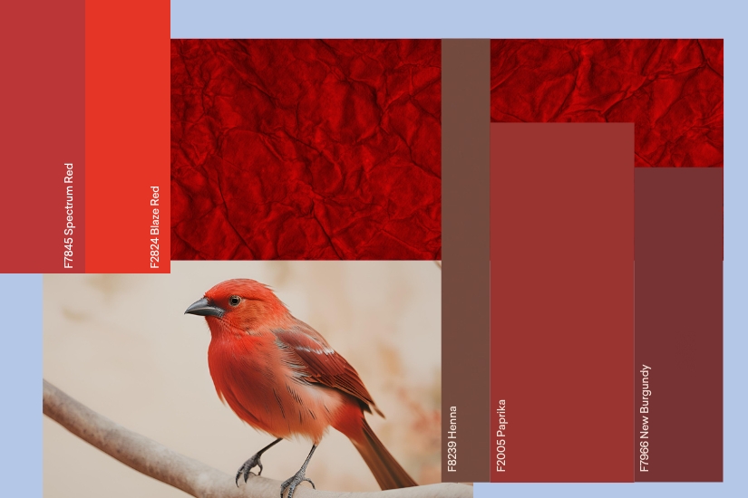
That said, not all shades of red are the same. At Formica Group, we provide a diverse selection of red hues, each offering its own distinct characteristics:
- Formica Laminate in F7966 New Burgundy, F2005 Paprika, and F8239 Henna: These darker, warmer tones evoke feelings of warmth, safety, and comfort. They are ideal for creating cosy, secure environments that feel cocoon-like—perfect for spaces where neurodiverse individuals can retreat and feel grounded.
- Formica Laminate in F7845 Spectrum Red and F2824 Blaze Red: These vibrant, energetic shades pigmented with more yellow, bring a sense of vitality and excitement. While they should be used sparingly, they can be highly effective in areas that benefit from stimulation and energy, such as creative workspaces or play areas.
By understanding the nuanced effects of different red hues, interior designers can carefully tailor environments to meet the specific sensory needs and preferences of neurodiverse individuals. The key is balance—using red to enhance energy where needed while ensuring it doesn't overwhelm.
The Calming Influence of Blue
In contrast to red's intensity, blue offers a calming influence. It has a profound impact on the body, inducing feelings of calmness and serenity. However, blue can also be perceived as cold, so it's important to choose the right shade for the intended space.
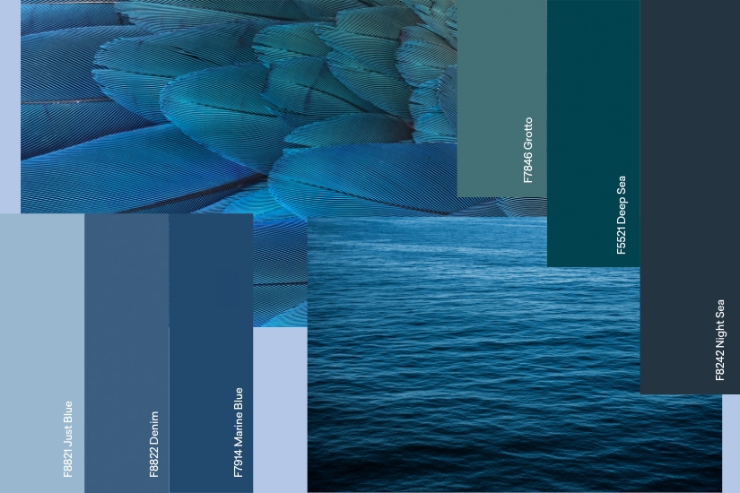
Discover the diverse blue tones from Formica Group:
- Formica Laminate in F8821 Just Blue: This light, tranquil shade promotes optimism and a sense of peace. It is an excellent choice for creating environments that feel open, airy, and soothing—ideal for areas where relaxation and tranquillity are paramount.
- Formica Laminate in F8822 Denim, F7914 Marine Blue, and F8242 Night Sea: These darker blues are associated with concentration and mental clarity. They are well-suited for spaces where focus and productivity are needed, such as study areas or offices.
- Formica Laminate in F7846 Grotto and F5521 Deep Sea: These teal tones, sit between blue and green, offering a balance of warm and cool. They are versatile choices that can create a balanced atmosphere, providing a calm and subtle sense of energy.
By incorporating these blue tones into your designs, you can create spaces that not only soothe but also support mental processes, making them ideal for environments where nurtured focus is essential.
Creating Balanced Environments with Reds and Blues
When designing for neuro-inclusivity, the strategic use of colour is vital. Reds and blues, when used thoughtfully, can complement each other to create environments that cater to a range of sensory needs. For example, a room with a predominantly calm blue palette might benefit from a touch of warm red to add a sense of energy, while a space that feels overly stimulating might be balanced with the calming influence of blue.
Curious to learn more about creating neuro-inclusive environments? Start with our introductory blog and discover how thoughtful design can make a difference for everyone.
Category
Related Articles


