Four Commercial Palettes Inspired by the Pantone Color of the Year 2020
Four Commercial Palettes Inspired by the Pantone Color of the Year 2020
We’re tickled blue by the Color of the Year 2020: PANTONE Classic Blue. According to Pantone, this selection instills a relaxed feel and is easily relatable. It’s a perfect antidote to today’s busy, tech-driven world.
To explore the many ways this special blue can be used in different industry settings, we’ve created four palettes that highlight a similar color: Formica® Brand Laminate in Marine Blue. Whether it’s the centerpiece of a well-built design or one color among many, Marine Blue can be used to charm audiences in a variety of spaces.
Restaurants: Blues and White Marbles
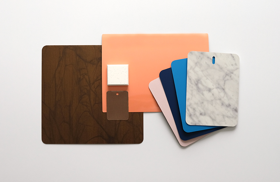
For restaurants, clever, unusual design is often the name of the game. Customers of fine dining are in search of an experience — something that lets them know they’re not at home. This palette emphasizes warm, soft and bright color accents perfect for defining an interesting eatery.
Marine Blue is ideal for inviting tabletops, bars or feature walls, while the lighter Matrix Blue provides contrast.
DecoMetal® Laminate in Oxibronze and Brushed Brasstoned Aluminum offsets the colorful elements with an artistic take on metallics that adds warmth.
Carrara Bianco, a classic favorite, adds a luxe touch with movement across expansive surfaces. Its counterpart, Bleached Concrete, continues the light surface in an understated, modern way.
Enter the unexpected with Just Rose and Solar Orange, soft but definitive color choices that round out the room with colorful accents.
Healthcare: Blues, Grays and Warm Wood Accents
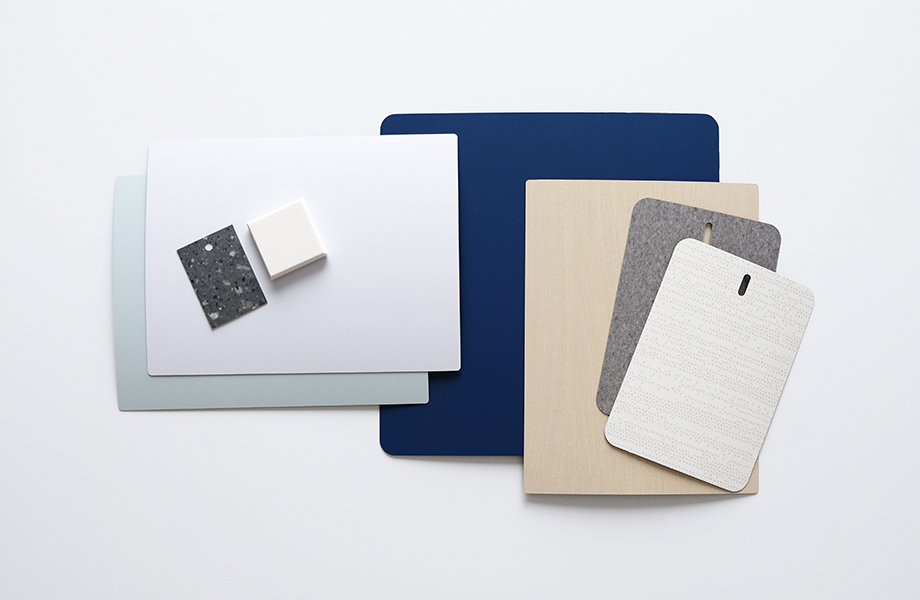
Healthcare design (particularly for acute care) is often a story of layered neutrals with natural features brought in whenever possible. In this palette, Marine Blue acts as a reassuring focal point surrounded by texture and movement. It anchors the other colors and patterns in a way that lets them add their own energy to the space. In the process, this cohesive whole works to provide a comforting environment for those often in stressful situations.
Tonal Paper Terrazzo contributes an understated pattern and soft look ideal for healthcare settings.
Natural Gray Felt creates a cozy feel in a small-scale optical solid that implies a sense of texture.
Cream Softwood is an understated woodgrain in an easygoing, light color featuring minimal graining. Its softness works to create a transition between real wood and other wood laminates.
Liquid Glass and Moonstone are gentle, aqueous colors that are pure and delicate to lighten the feel of any space.
Luna Sand Everform™ Solid Surface is a hardworking and hygienic selection with just a hint of patterning on an otherwise creamy surface.
White Drops adds a playful aspect to surfaces that need not only to look clean, but to be cleaned frequently for hygienic purposes.
Education: Curves and Playful Postmodern
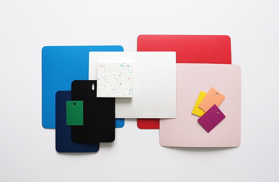
Educational spaces can let interior designers flex their color palettes to the max, particularly with younger audiences. This collection of bright hues and interesting patterns was inspired by the Italian Memphis Style that burst forth in the 1980s. With its contrast of hard industrial edges and soft curves, this colorful movement and its latest interpretations represent a fun break with tradition. Above all, it speaks to letting individuals just be themselves — a core concept within education.
There’s a veritable rainbow of colors here that can be brought together in eye-popping ways across furniture, walls and doors, shelving, hallways and more. In this look, Marine Blue is one of many options to add intrigue alongside Matrix Blue, Spectrum Green, Spectrum Red, Chrome Yellow and Amarena.
Students and visitors can bring on the doodles with the ImagiGrid Formica® Writable Surface. This geometric pattern is perfect for interaction and offers a nice neutral to balance out the array of colors.
Sea Glass Everform™ Solid Surface provides a second neutral but with a touch of levity in the form of colorful flecks. It can be molded into virtually any shape to bring unique designs to life.
Just Rose is a subtle but noticeable shade that acts as a counterpoint to the nearby attractions. It functions as a duo alongside Solar Orange, a muted and delightful selection for young learners. These two beautiful colors work well as soft accents that let the personalities of the bolder colors come through without being overwhelming.
Hospitality: Black and Blue
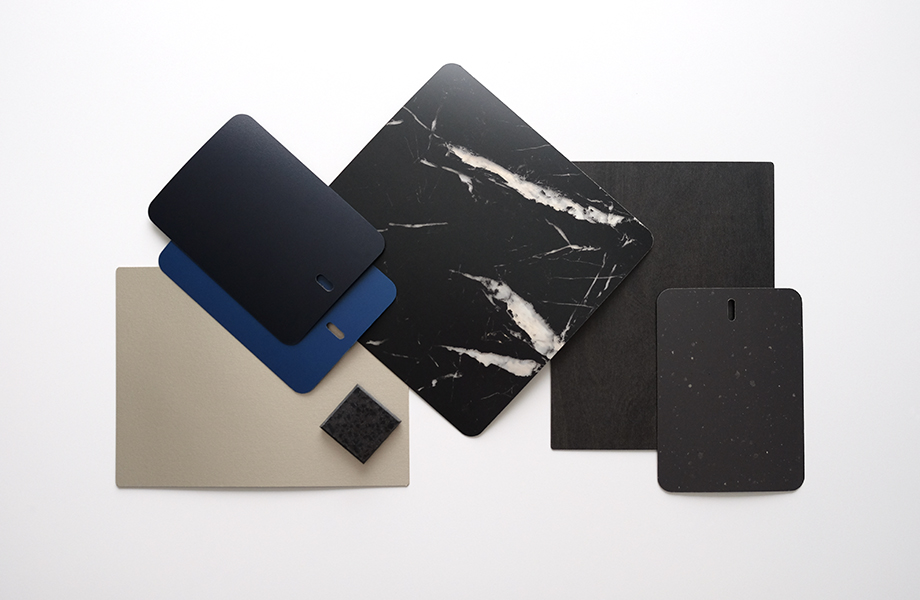
This moody hospitality palette was inspired by the process of “bluing,” during which steel is treated to protect against rust. The result is a blue-black or dark gray appearance. When thinking of hotel spaces, you may seek to create something that offers the comforts of home but in an unexpected way that lets guests know they’re in for a real treat.
Black Lava Everform™ Solid Surface shows subtle movement for hardworking areas ready to withstand the daily rigors of hospitality environments.
Black Recycled Kraft is the steadfast optical solid great for function with flair.
Black Birchply features a black stained plywood look. Its ply roots render it modern while at the same time understated.
With the large-scale drama of Nero Marquina, white veining transforms the opaque surface to remind us of the power of nature.
The black-blue Nocturne works to transition the palette from black to Marine Blue, which is at the heart of this gathering.
Plex Argent DecoMetal® Laminate rounds out this look with texture and metallic shimmer that offsets the tone-on-tone complexity of the overall compilation.

