Inspiration
Welcome to the New Formica.com: Designed Around You
August 21, 2026
External article highlighting new website features
5/20/2022
Inspired design requires a broad range of solid colors, from classic neutrals and bold primaries to trend-forward hues. Often missing, though, are those in-between shades that can subtly define modern environments without being the star of the pigment show.
These sophisticated in-between colors are highly versatile and have become a staple in today’s design toolkits. Let’s look at the six statement shades of Formica® Laminate anchoring these modern palettes.
8822 Denim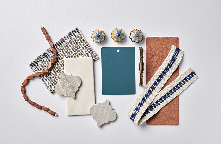
A mid-tone blue, Denim falls somewhere between a true gray and full-spectrum blue. As seen in this concept palette, it’s a beautiful selection that pairs flawlessly with other muted tones, offering balance with warm leather, wood and metallic elements. The creamy whites and grays also work nicely with Denim to achieve a refined design that wouldn’t be possible using a full-spectrum blue.
8793 Green Slate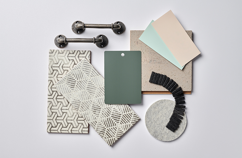
Green Slate adds a biophilic component to this appealing palette. It complements the warm taupe tones and gray felt to create an inviting look. As an in-between color, this earthy shade functions as a counterpoint to soften the concrete elements in this design collection.
8238 Blush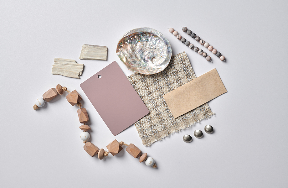
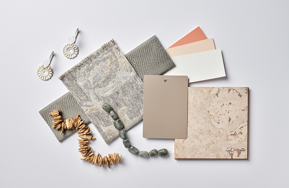
Each piece of this design palette is cozy and comforting, with hints of rosy tones appearing throughout. Blush is a soft color that adds depth to the composition, which may feel too sandy without it.
5349 Fossil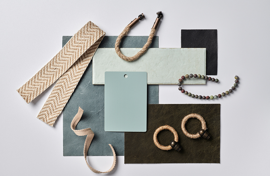
The softness of Fossil freshens this design palette without being overwhelming and modernizes a look that might be dated without it. Although the base palette is muted, it’s able to brighten the black and chocolate tones and balance out the hints of beige.
3202 OtterOtter conveys a fresh, nuanced take on the role of the in-between color. This look is similar to the Blush design palette with its emphasis on neutrals, yet it blurs the lines between gray, cream and taupe. The result is a sense of balance that makes the collection more interesting to experience as a whole. It’s a great palette for a home kitchen or living room as well as commercial spaces like medical offices.
1196 Purple Dye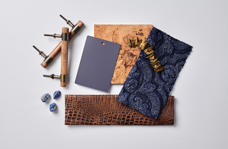
Purple Dye is a bit bolder than the other in-between colors we’ve highlighted, but it still qualifies as a muted option. This hue brings a sense of richness without being overly saturated or extravagant in the way of a true royal purple. The cork and leather in the design palette are luxe elements, but Purple Dye grounds the overall look to give it depth and make it feel approachable.
Inspiration
August 21, 2026
External article highlighting new website features
Inspiration
April 8, 2026
Nature-Inspired Color, Texture and Stone Patterns That Create Calming Interior Spaces
Inspiration
March 6, 2026
Designing Healing Healthcare Spaces with Homapal® Metal Laminates for Beauty, Durability and Comfort


