Four Residential Palettes Inspired by the Pantone Color of the Year 2020
Four Residential Palettes Inspired by the Pantone Color of the Year 2020
Every year since 2000, Pantone has announced a color it sees as in keeping with the times. PANTONE Classic Blue is the Color of the Year 2020. Pantone describes this hue as non-aggressive and easily relatable, lending itself to relaxed interaction.
At Formica Group, we love this shade of blue and have created four palettes for innovative home spaces that highlight a similar color: Formica® Brand Laminate in Marine Blue. This warm, inviting hue can be used as a bold focal point or to accent woodgrains or light neutrals in a variety of spaces. See for yourself in these unique arrays.
Something Old, Something New
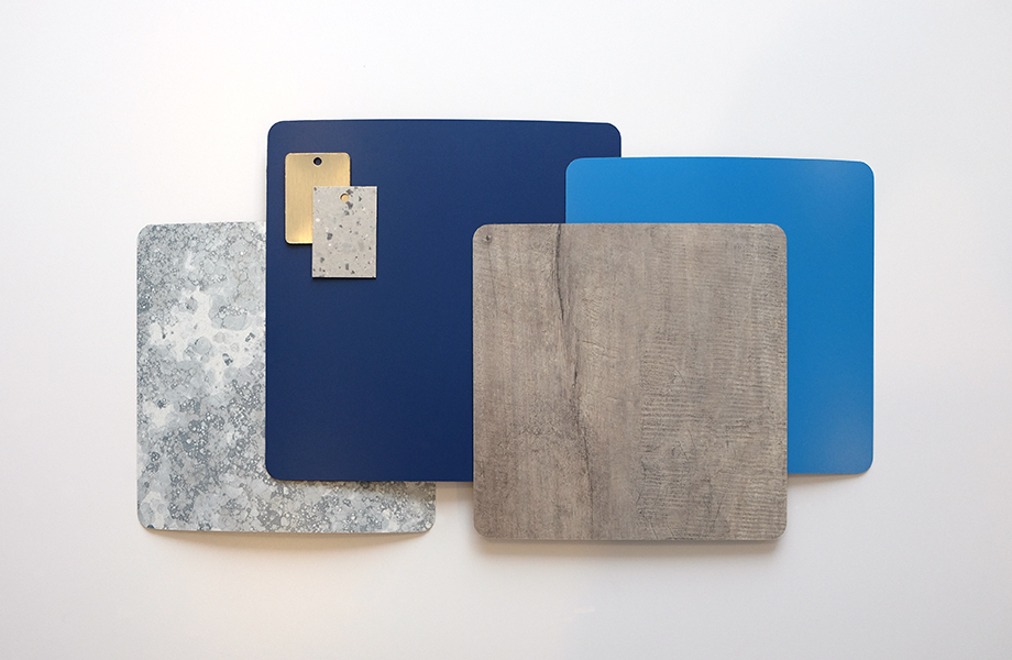
The concept of “something old, something new, something borrowed, and something blue” isn’t just about weddings! With a nice mix of monochromatic blue and gray, the blend of modern and timeless in this palette gives it fresh appeal and multiple texture options to surprise and delight. Blue, aqua and gray meld beautifully with brass metal accents and classic wood looks for a fresh vibe.
Marine Blue and Matrix Blue complement one another without competing to be the dominant color in this arrangement. They are reminiscent of natural elements like water and sky to add a relaxed feel.
Bubble Science brings the fun with a hint of whimsy and movement. The blue and gray bubble pattern works to change up the bold solids anchoring the look.
Tinted Paper Terrazzo harkens back to Mid-Century Modern design and a simpler time with its confetti paper charm and subtle coloration.
The outside comes in with the gray-brown Weathered Beamwood, the perfect choice to add depth and linear patterning.
Metallic surfaces go a long way to add shine, and Brushed Brasstoned Aluminum DecoMetal® Laminate does just that. The look of classic brass not only takes us back to days gone by, but it also speaks to the need to preserve and represent historical components in today’s spaces.
Modern Blue
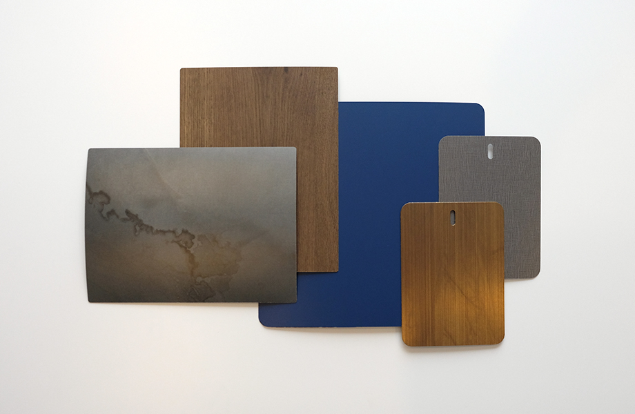
This dark and pensive combination includes a little bit of everything brought together in a memorable, cohesive whole: Think blue accents, watercolors, woven fabric texture, metallics and dark woodgrains. The sum of these parts is an inviting room where your eye can find new wonders in every corner. It is the very definition of modern design with its ability to leverage the best parts of many different constituents.
Marine Blue once again sets the stage in this palette, but here it’s the sole blue functioning as the foundation for a layered look with a variety of textures. It speaks of relaxed afternoons with friends and family.
Citadel Warp continues the texture journey with a subtle, woven appearance in a moody, natural shade.
Watercolor Steel will turn heads with its undulating effect and coloration reminiscent of rolled steel. This unique design was created with watercolor paints, alcohol and forced air to remind us of natural marble as seen through the eyes of an artist.
Oxibronze DecoMetal® Laminate adds subtle sophistication. It sets off the other surfaces beautifully while lending a charming aura to feature walls or cabinet fronts.
Woodgrains are essential to a well-balanced plan, and Coffee Planked Oak is a modern take on an old favorite.
Classic Beach Cottage
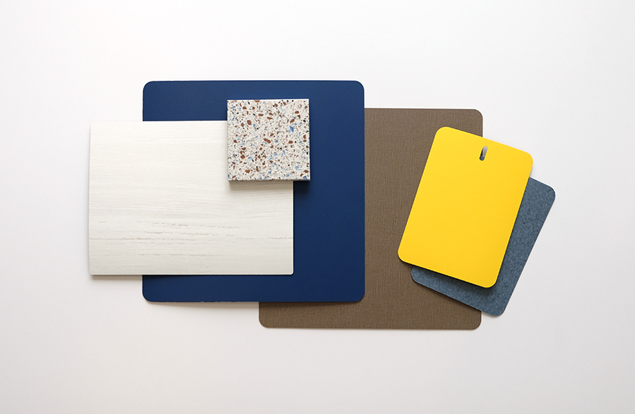
Bringing the feel of a day at the beach into your home could be just what you need to reinvigorate your space. In this look, classic blues mesh with white to bring in the colors of the sea and sky. Natural elements continue with the feel of painted reclaimed wood and woven textiles. All told, this palette speaks of leisure and repose.
Marine Blue defines the mood as one of relaxation and calm, accented by the harmonizing tone of Blue Felt. This blend of an optical solid with a familiar textural pattern instills a cozy feel.
Chrome Yellow brightens the palette with its sun-evoking radiance, the perfect perk of color to wake you up after a morning spent outside.
Our thoughts go to driftwood and shiplap when White Painted Wood enters the picture with its rustic magnetism and timeless allure.
Bottle Glass Quartz Everform Solid Surfacing brings the sandy beach inside with all of the fun and none of the mess. Its flecks look like glass worn from tumbling in the tide and tie together the other components of this look while breaking up the more linear patterns.
Earthen Warp emulates classic woven linen with its grounded, woodsy feel, bringing an additional impression of nature.
Dramatic Blue Kitchen
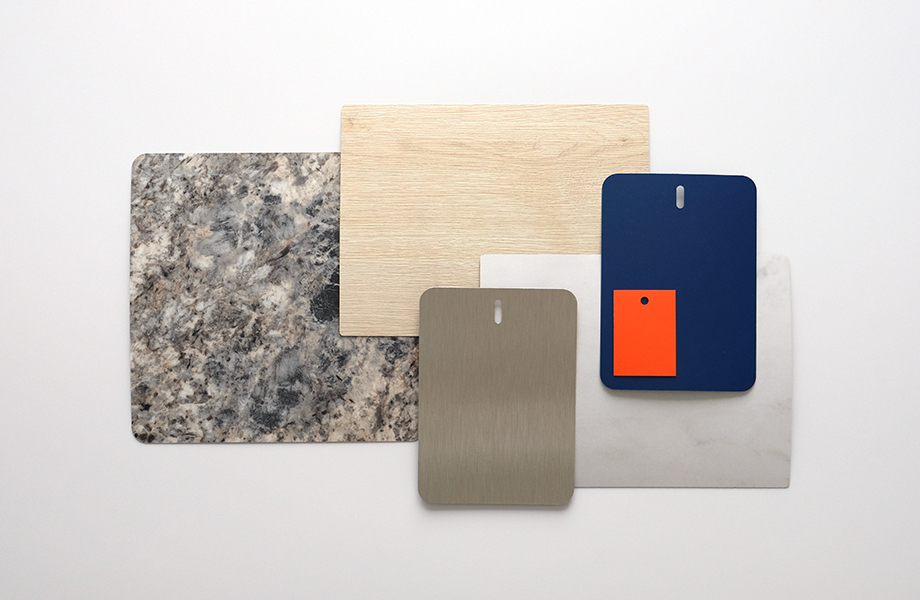
Strong blues are making a statement in contemporary kitchens, with this confident color appearing on cabinetry, countertops, feature walls and tabletops. Here we explore how to accent this rich hue with movement, texture and a bold complementary shade.
This palette is a tour de force with Marine Blue as its foundation. Clementine advances the look with a bright, not-to-be-missed intensity.
The ever-popular Blue Flower Granite adds the intrigue of natural stone in a large-scale pattern with color and movement.
Calacatta Cava is all about nuance and the endurance of white marbles, offering a delicate balance between the strong color components and the light stone looks.
The warmth of wood comes in clearly with Planked Raw Oak, a light, clean surfacing choice that harmonizes with the other selections.
Finally, the metallic sheen of Aluminum Stainless II DecoMetal® Laminate encapsulates a classic culinary staple that evokes cleanliness and grandeur.

