
Commercial Interiors
The power of wood in interior design
March 12, 2026
Explore smart wood design palettes and practical uses of wood-inspired laminates in interiors from the Formica® Woods Collection.
Category | Commercial Interiors
These colours, known for their grounding and energising properties, can play a pivotal role in creating supportive and balanced environments for neurodiverse individuals.
The Comforting Influence of Brown
Brown is an earthy, timeless colour that brings warmth, stability, and a sense of security to interior spaces. Its natural tones are soothing and non-intrusive, making it ideal for environments designed to support neurodiverse individuals, particularly those who may experience sensory overload.
For autistic individuals, who are often sensitive to bright or intense colours, brown tones provide a grounded and neutral backdrop, helping to minimise the sensory load. Similarly, those with ADHD and Tourette’s may find brown calming, as it fosters a sense of tranquillity without being too dull or distracting.
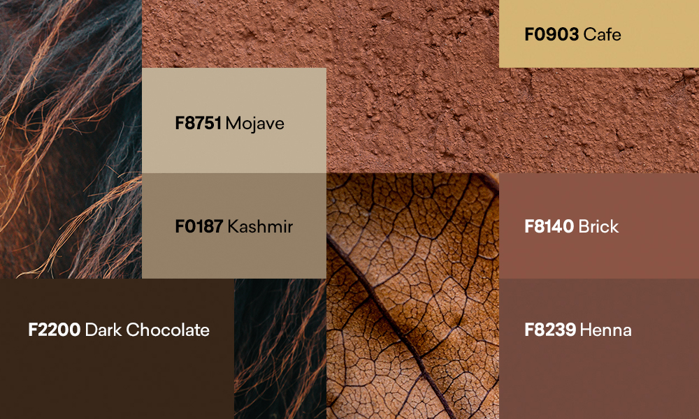
In neuro-inclusive design, brown’s ability to evoke feelings of safety, stability, and calm make it a powerful tool. By incorporating a variety of brown tones, designers can create interiors that not only look inviting but also promote emotional well-being for neurodiverse individuals.
The Energising Power of Orange
Orange is an invigorating colour that stimulates both emotional and physical reactions. It’s a vibrant, joyful hue that encourages interaction and positivity, but it must be used thoughtfully in neuro-inclusive design, especially for individuals who are sensitive to overstimulation.
For individuals with ADHD, for instance, muted oranges can help strike a balance between energy and focus. On the other hand, brighter oranges may be too much and lead to restlessness. Similarly, for those with Tourette’s or tics, muted, earthy oranges can be used without triggering anxiety or stress.
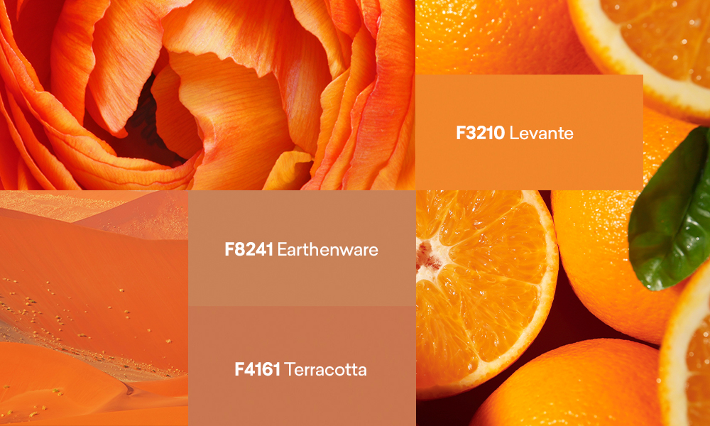
Here are some of the orange tones available from the Formica Laminate Collection:
In neuro-inclusive design, the key to using orange effectively is moderation. While the colour can energise and uplift, it’s essential to avoid overwhelming the senses. For those with conditions like Tourette's or autism, soft, muted shades of orange can offer warmth without triggering stress or sensory overload.
Tailoring Colours to Neurodiverse Needs
When designing spaces for neurodiverse individuals, colour choice plays a pivotal role in how the environment is experienced. The calming influence of brown, paired with the energising power of orange, offers a dynamic balance that can be tailored to various needs.
For individuals with autism, soft browns and muted oranges create a calm, grounding environment. In contrast, brighter shades may spark discomfort, so they should be used sparingly or in spaces where more sensory engagement is desired.
For individuals with ADHD, deep, warm browns can promote focus and concentration, while small doses of muted orange can stimulate creativity without causing distraction. Brighter oranges, used in moderation, may be beneficial in environments that encourage active engagement, such as group workspaces or creative studios.
For individuals with Tourette’s or tics, earthy, subdued tones like soft browns and gentle oranges help establish calm. Bright or intense colours, particularly orange and red, should be avoided, as they may trigger stress and anxiety, exacerbating symptoms.
Incorporating brown and orange thoughtfully into neuro-inclusive spaces helps create environments that are not only visually appealing but also tailored to the sensory and emotional needs of neurodiverse individuals.
Commercial Interiors
March 12, 2026
Explore smart wood design palettes and practical uses of wood-inspired laminates in interiors from the Formica® Woods Collection.