
Commercial Interiors
The power of wood in interior design
March 12, 2026
Explore smart wood design palettes and practical uses of wood-inspired laminates in interiors from the Formica® Woods Collection.

Category | Commercial Interiors
Colour is not just a visual element but a powerful tool that can significantly influence mood, behaviour, and sensory experiences. When designing for neurodiversity, this becomes even more crucial as different hues can either support or challenge the sensory needs of neurodiverse individuals.
The Dynamic Nature of Red
Red is a colour that commands attention. It stimulates both the body and mind, generating energy and excitement. However, it's important to approach red with care in neuro-inclusive spaces. In large quantities, especially in its brightest shades, red can become overwhelming, potentially leading to feelings of defiance or aggression. This makes it less suitable for areas intended for relaxation.
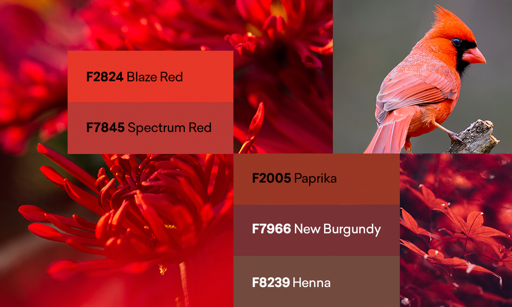
That said, not all shades of red are the same. At Formica Group, we provide a diverse selection of red hues, each offering its own distinct characteristics:
By understanding the nuanced effects of different red hues, interior designers can carefully tailor environments to meet the specific sensory needs and preferences of neurodiverse individuals. The key is balance—using red to enhance energy where needed while ensuring it doesn't overwhelm.
The Calming Influence of Blue
In contrast to red's intensity, blue offers a calming influence. It has a profound impact on the body, inducing feelings of calmness and serenity. However, blue can also be perceived as cold, so it's important to choose the right shade for the intended space.
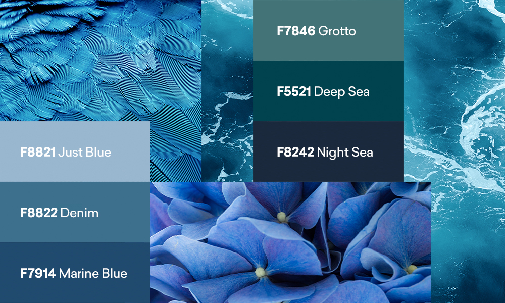
Discover the diverse blue tones from Formica Group:
By incorporating these blue tones into your designs, you can create spaces that not only soothe but also support mental processes, making them ideal for environments where nurtured focus is essential.
Creating Balanced Environments with Reds and Blues
When designing for neuro-inclusivity, the strategic use of colour is vital. Reds and blues, when used thoughtfully, can complement each other to create environments that cater to a range of sensory needs. For example, a room with a predominantly calm blue palette might benefit from a touch of warm red to add a sense of energy, while a space that feels overly stimulating might be balanced with the calming influence of blue.
Commercial Interiors
March 12, 2026
Explore smart wood design palettes and practical uses of wood-inspired laminates in interiors from the Formica® Woods Collection.